A franchise-record SEVEN Phillies players have been selected to the 2024 MLB All-Star Game in Arlington, Texas next week. Bryce Harper, the top vote-getter for the National League will join Trea Turner and Alec Bohm at the midsummer classic, meaning the Phillies will make up 60% of the NL infield. Hilariously, no Braves or Mets were selected to start this year.
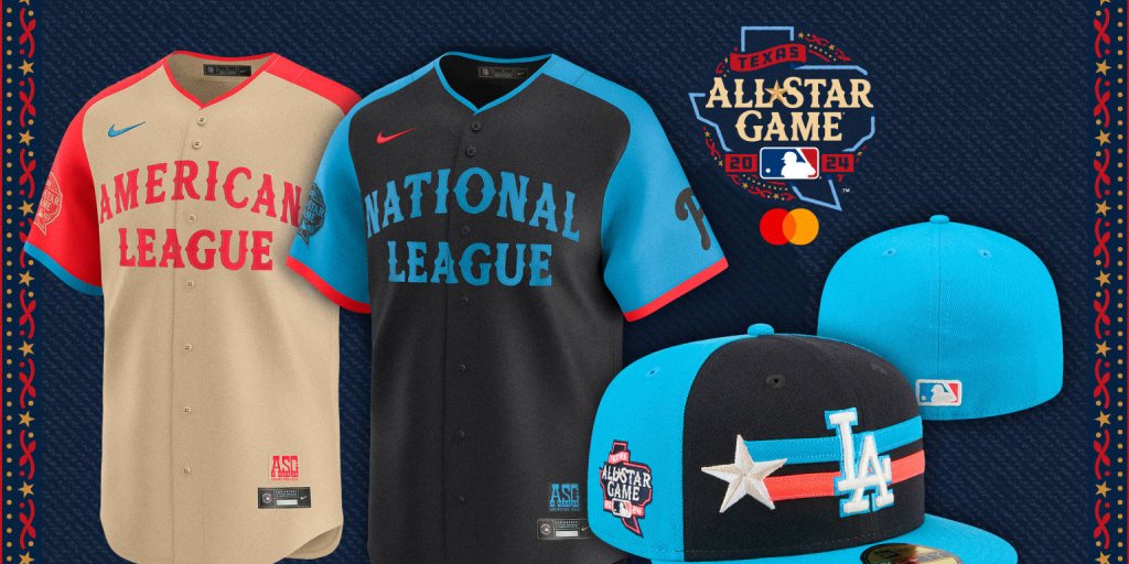
Normally I’d be ecstatic about the Phillies success, it’s a tremendous achievement by a team that has overachieved all season. I was ecstatic about the accomplishment but then I saw the All-Star game jerseys. In what seems like some sort of sick joke, the MLB, Fanatics, and Nike, hellbent on squeezing every dime out of baseball fans, designed the ugliest professional sports jersey I have ever seen. I mean, look at this abomination selling for $194.99 retail!

Ugh. What is this? Everything about it is completely wrong. The terrible, juvenile color combination juxtaposed with the old-timey “this-town-ain’t-big-enough-for-the-two-of-us” font is jarring, to say the least. You could have a similar experience by mixing home-brewed whiskey with Big League Chew. I don’t want to watch seven of my Phillies wear this garbage. Why did the MLB pick black uniforms for a mid-July game in Texas? I will never know.
MLB claims the All-Star jerseys “feature a design inspired by Texas’ western heritage, with typography and graphics that exude the classic vibes of the Lone Star State but with a contemporary aesthetic.” Yeah, because when I hear “Texas’ western heritage,” the first thing that comes to mind is an orange, electric blue, and black color palette reminiscent of a run-down laser tag arcade. I can almost hear the echo of the overweight, underpaid employee reprimanding kids for taking off their vests.
Somehow, the hat is even worse. It looks like it was pulled straight off a mid-2000’s middle-schooler who’s sporting a monster energy and Cookie Monster pajama pants. Honestly, if you told me you found this jersey on a Hot Topic clearance rack two decades ago, I would fully believe you. The whole thing looks like it was designed by Buster Scruggs’s midwestern emo teenage son.
How did the MLB get this so wrong? They already had the answer. The All-Star games of yesteryear featured players wearing their respective team’s jerseys, with a patch on the hat denoting that they were playing in the all-star game. Sure, they had weird, poorly-designed all-star game outfits too, but they only wore them during batting practice. Then, like an ugly caterpillar metamorphosing, they’d shed their heinous outer layer to reveal the true beauty underneath. Do you even realize how exciting it’d be to watch Bryce Harper shed his outer layer? That’s the most beautiful butterfly I could ever imagine.
In short, congrats to our seven Philadelphia All-Stars. They’ve truly earned their spot among the best in the league. Now, if only we could earn a place for these jerseys in the Hall of Shame. Let us all unite not just to cheer for our All-Stars but also to demand better from the design team at Nike, Fanatics, and the MLB. If there’s one thing Phillies fans won’t stand for it’s mediocrity, especially when it’s wrapped in fluorescent orange and blue. We deserve better, and so do our eyes.

Leave a comment